I’ve always liked “population pyramids” as way of showing the age and gender distribution of a population. I recently found a very nice set of population pyramids: Population Pyramid of WORLD in 2010 — PopulationPyramid.net. Here is a snapshot of the World population in 2010:
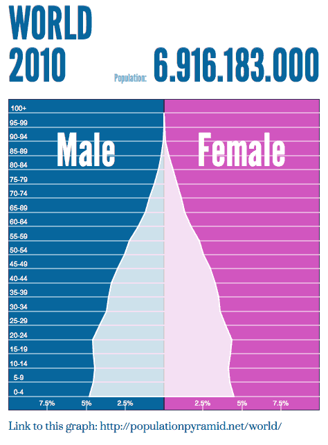
This is a static snapshot, but the web page it links to allows you to change which 5-year period (including projections into the future up to 2100) and the geographic region (most countries, plus several larger geographic areas, such as South America, or Southern Europe). It also uses a mouseover so that you can read what % of population each point on the graph corresponds to, and provides a plot of total population as a function of time.
Several countries in the developed world have “top-heavy” pyramids, with fewer children under 5 than adults in the baby-boom generation. For example, Germany has 8.7% of its population in the 45–49 age range, but only 4.1% in the 0–4 age range. The German population is predicted to have already passed its peak population, with increased longevity not compensating for reduced birth rate (population is expected to drop to about 68% of the peak in 2005 by 2100). Japan is in a similar situation with a 2100 population predicted to be about 66% of the 2010 peak. Its largest cohort is older, 60–64 years old at 7.7% of the population and children 0–4 are only 4.3%.
The US has remarkable little variation from decade to decade—the “baby boom” and the “boom echo” are visible, but they are tiny ripples compared to the enormous variations in some other populations: the peak of the baby boom is 7.3% in 45–49 year olds (you’d expect it to be 50–54 year olds, but the leading edge of the baby boom is starting to die out) and the smallest younger cohort is still 6.5% (for either 0–4 or 35–39). The distribution of ages is predicted to get very flat, with population growth occurring mainly due to longer life spans rather than high birthrate.
Other parts of the world have the more classic “pyramid” shape that comes from high birth and death rates. Western Africa, for example, has 17.2% of its population in the 0–4 age range, tapering down smoothly to about 2.2% in the 50–54 age range.
All the populations are expected to get more uniform with time, as death rates and birth rates drop, but I fear that this may be optimism on the part of the United Nations—major wars can carve big chunks out of the young adult population, and famines can send death rates soaring.

")
 or hardback ($198)")


Leave a comment